
home | links | compass

Subjectivity–Objectivity
complementarity of
collaborative intelligence
Subjectivity – our diverse
POVs and interpretations
Objectivity – the facts of
the world we interpret
Knowledge Visualization |
| visualization to support pattern recognition and collaborative intelligence |
|
|||||
Knowledge Visualization is an exploding domain of research. The focus here is on aspects of this research that contribute to defining collaborative intelligence. Traditionally, visualizations communicated the visualizer's strategy for interpreting data. Increasingly, knowledge visualization is becoming an interactive tool to support each user's problem-solving process and has spawned the newer field of Visual Analytics. The future potential of knowledge visualization lies in its capacity to support distributed teams working across disciplines on hard problems that demand collaborative intelligence in a multi-agent system, such as sustainable remediation, urban planning, and disaster preparedness where problem-mapping is needed to track problem-solving in process. |
|||||
|
Atlas of Science. MIT Press 2010. In this compendium the ancient tradition of cartographic maps to navigate the globe is translated by author Katy Borner into a new dimension, the navigation of knowledge across disciplines. A leader in building the community of collaborators defining this research domain, she shows how maps of science not only enable us to visualize scientific results but also support collaborative intelligence — visualization of interactions that occur as knowledge evolves. The Atlas of Science contains more than thirty full-page science maps, fifty data charts, a timeline of science-mapping milestones, and 500 color images. |
||||
One of the most important corporate initiatives to build collaborative intelligence through shared visualizations is the IBM Many Eyes initiative. Users build visualizations and share them with the community. Users rate visualizations; those deemed most useful rise to the top of the ratings. |
|||||
The most effective visualizations go beyond representing information to uncover a dynamic and thought-provoking way to interact with that information so that learning and new insight result. Many Eyes is identifying communities of practice who could take the next step to develop problem-solving innovation networks, using their visualization tools to support the practice of collaborative intelligence. |
|||||
|
|||||
From Mapping Space to Mapping Concepts
|
|||||
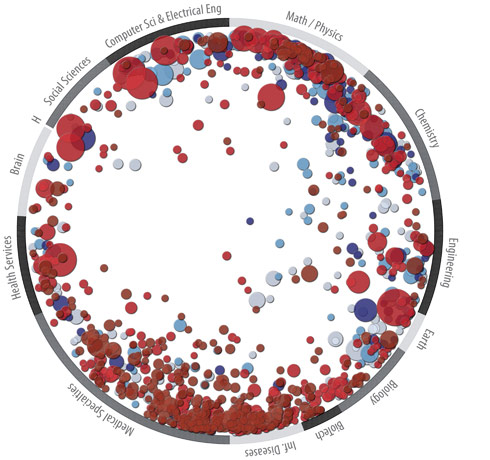
Science Competency Maps – SciTech Strategies Over 2.1 million highly cited references, and over 5.6 million articles (2003-2007) that cite these references were assigned to over 80,000 categories (called paradigms) using co-citation methods. |
|||||
 |
|||||
Source, above and below: SciTech Strategies. © 2010. In the image above, in Atlas of Science. p.137, numbers of citations correspond to the size and color-coding of bubbles, allows quick visualization of disciplines where many contributors have more equal importance (medical specialties), in contrast to Social Sciencies and Computer Science where a few authors have introduced concepts that are widely cited. The visualization below, using data from WoS and Scopus for 2001 - 2005 for 7.2 million papers in more than 16,000 separate journals, proceedings, and series analyzes papers across 554 disciplies for bibliographic coupling, making it easier to see cross-disciplinary collaboration and to identify where Innovation Networks might emerge. Klavans and Boyack have identified 776 major scientific paradigms and investigate relationships between them. Atlas of Science. p.13. |
|||||
|
|||||
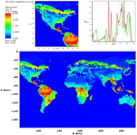
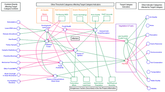
Visualization of Data, Indicators, and Thresholds
Imagery in a Knowledge Framework. Overlaid on indicators of environmental quality are dynamics of interactive systems, visualized below. Rao created a visualization that counterposes consumptions (energy, water, food, materials) with impacts (on land use degradation, pollution, biodiversity, and climate change). Here again, no imagery could cover the full complexity of interacting systems, Rao's aim was to create a representation that could convey to the general public the interdependency of environmental indicators. 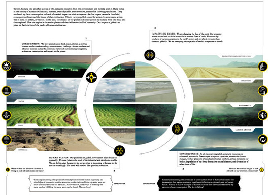 |
|||||
|
|||||
|
|||||
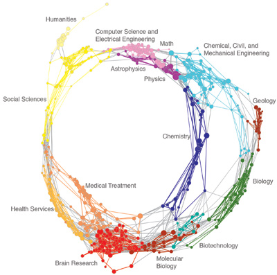
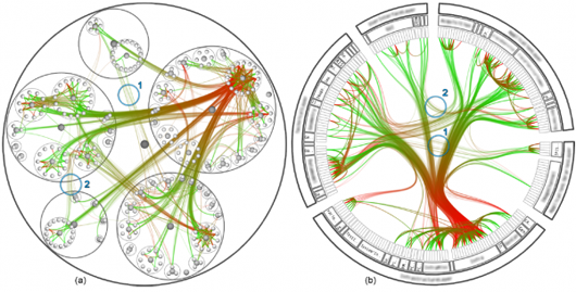
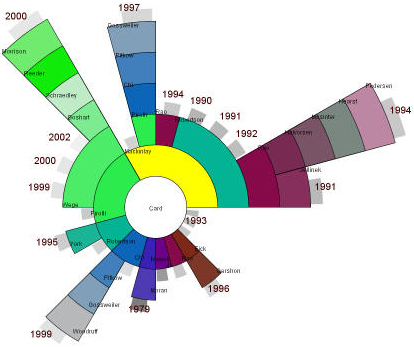 Stuart Card at the Palo Alto Research Center has had a range of collaborations with others in the field of information visualization, as shown graphically in the diagram above. |
|
||||
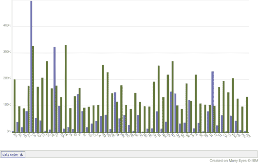
Visual analytics focuses on how human interaction with visualization systems augments the process of data analysis. Visual analytics has been defined as "the science of analytical reasoning supported by the interactive visual interface" (Wikipedia links) and now has an active community wiki. Within massive, dynamically changing information spaces, visual analytics research concentrates on support for perceptual and cognitive capacity to support autonomous users to recognize patterns, and possibly discover the unexpected in complex information spaces. Technologies resulting from visual analytics can be applied in a range of fields, with particular current emphasis on biology and national security. Visual representations of complexity allow us to use our sophisticated pattern recognition capacities to find new meaning in data, as in this graphic by Michael Levi that compares countries, their populations and GDP. Whether any particular method increases the collaborative intelligence of distributed teams can only be demonstrated in practice. For some data, such as World Population or World Population Growth Rates or Annual World Population Change merely seeing the data rendered visually is a stimulus for problem-solving. But the more interesting and challenging question lies in how to visualize the problem-solving process so that all agents participating can increase their collaborative intelligence. The TRACE Cognitive model proposes one representation of process steps. |
|||||
|
|||||
©2011 Zann Gill Please attribute, linking to this site. Contact: webmaster at collaborative-intelligence. org |
|||||
LINKS
References
AI Conferences
Animating Time Data
Climate Collab
Darwin papers
Gapminder
Geo-tagger's World Atlas
Innovation Networks
London Open Street Map
Microbes–Mind Forum
MIT Center for
Collective Intelligence
Planet Innovation
Recommender Systems
SIGCHI
SIGEVO
SIGGRAPH
Vinge on Singularity
Wall Street Journal
BOOKS
![]()
Card, Mackinlay &
Schneiderman –
Information Visualization
![]()
Hansen, Schneiderman,
Smith – Analyzing Social
Networks - Node XL
![]()
Ehrlich - Humanity
on a Tightrope
![]()
Kelly – What
Technology Wants
![]()
Superorganism
![]()
Robert Ulanowicz
A Third Window
![]()
Axelrod – Evolution
of Cooperation
![]()
Axelrod – Complexity
of Cooperation
![]()
J Fodor & M P
What Darwin Got Wrong
![]()
E Jablonka & M Lamb
Evolution in 4D
![]()
M Kirschner & J Gerhart –
Plausibility of Life
![]()
J Scott Turner
Tinkerer's Accomplice
![]()
J Scott Turner
The Extended Organism